Some Stamps too colorful for HSBC
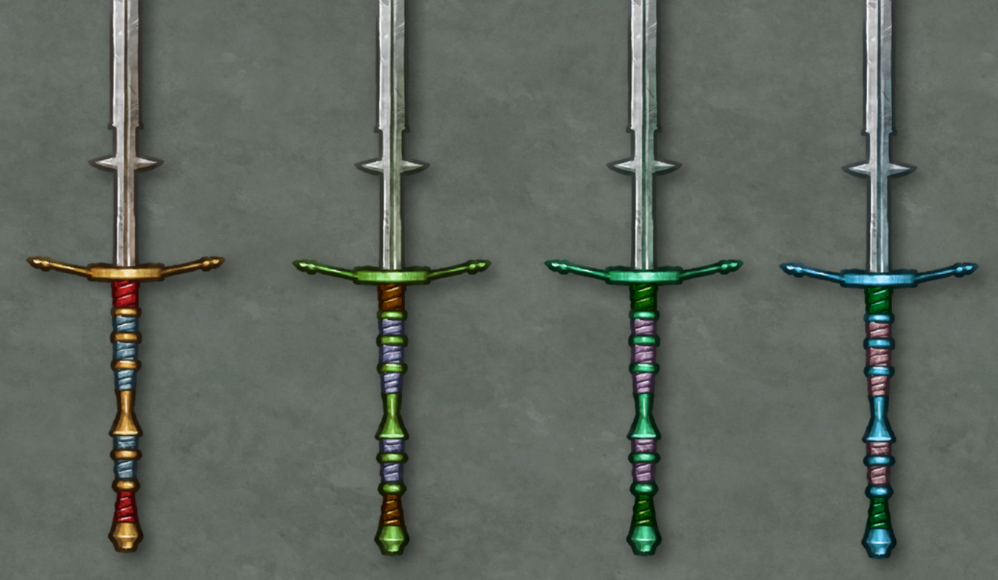
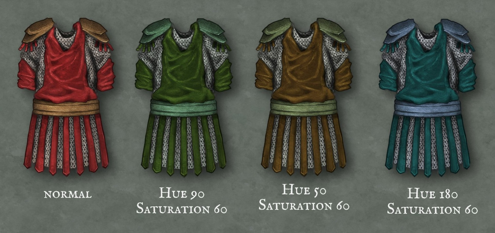
Request from Discord (Nepeta): "I find some of the stamps too colorful, though. If you put two or more colors on a stamp, the hue tool becomes all but useless. The colors may look good together at the intended hue, but when shifted, they clash. This severely limits our options in variation.
This is also a reason why people are asking for modular beds - because when you shift the hue to get e.g. a green bed cover, the wooden bed frame turns purple.
It would be great if the number of different colors in a stamp could be limited to ONE (or two that change similarly) and some grey/black/white that does not shift at all. "
Please authenticate to join the conversation.
Registered
Art Requests
About 1 year ago

Matthias
Subscribe to post
Get notified by email when there are changes.
Registered
Art Requests
About 1 year ago
Matthias
Subscribe to post
Get notified by email when there are changes.